 Release tips
Music landing page examples for a single
A good landing page for a single does one job: it gets a fan from your link to your song. It needs your cover, your name, the song title and a button for each platform, and it has to work on a phone. Everything else is optional.
Examples for a single
These three pages show the same idea in different layouts. Each one takes its colours from the cover, so it looks like the song before anyone presses play. The artists and songs here are made up for the examples.
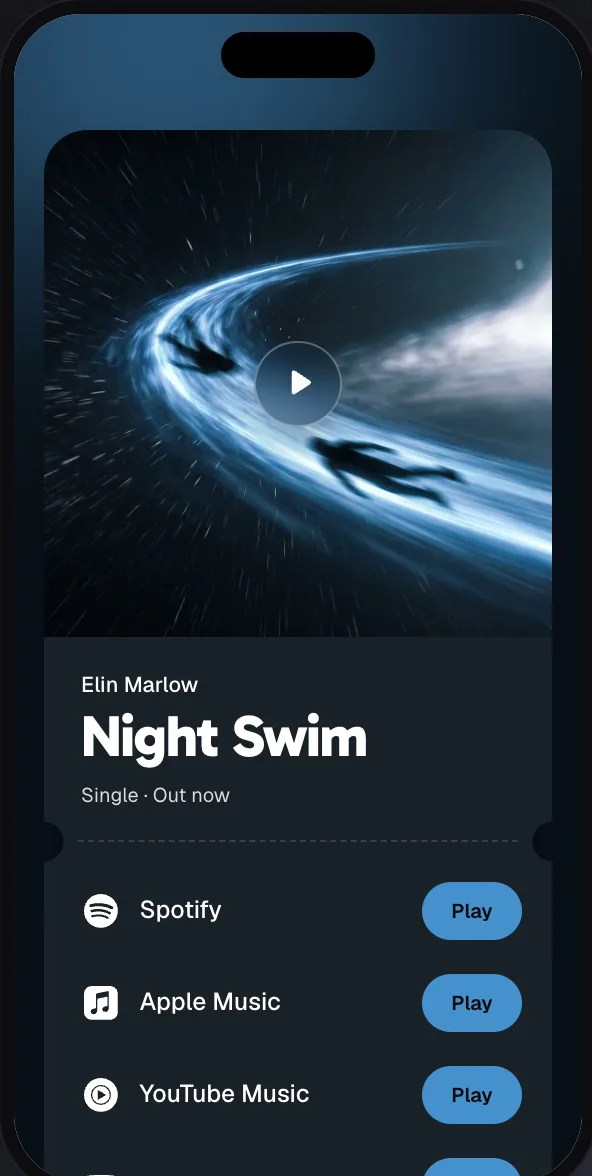
Pass
Cover on top, like a ticket. Free plan.
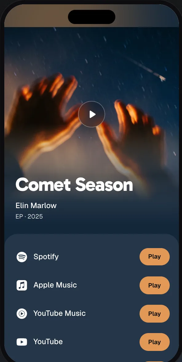
Stage
The cover fills the top. Free plan.
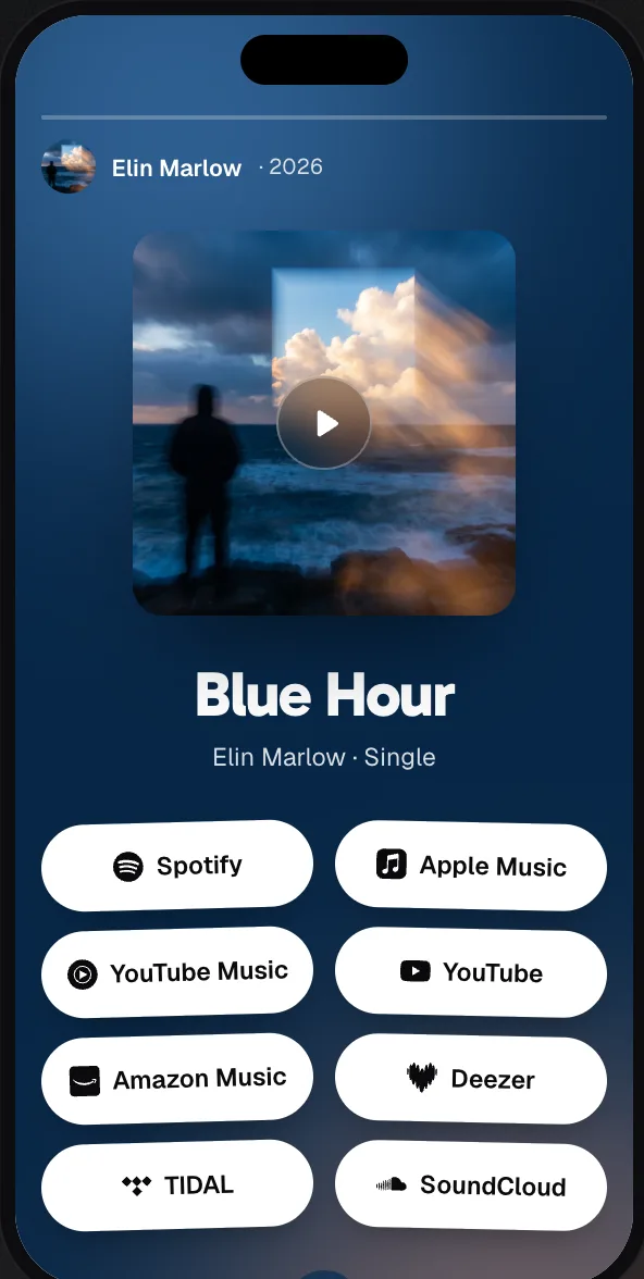
Story
All platforms at a glance. Artist plan.
You can open a live example page on your phone to see how it feels.
What every page needs
- Your cover, big. It’s what fans recognize from your post. It tells them they’re in the right place.
- Artist and song title. Written out as text, so they’re easy to read and easy for search engines to find.
- A button for each platform. Put the ones your fans use most at the top.
- A preview for messages. When someone sends your link, the cover and title should appear in the chat.
What to leave out
Every extra thing on the page is one more reason not to tap. Before you add something, ask whether it helps a fan get to your song.
- Pop-ups and cookie banners. On a phone they can cover the whole page.
- A long bio. Someone who taps your link wants to hear the song. Your story can wait.
- A menu with many pages. Save that for your website. This page belongs to one release.
- Heavy video backgrounds. Slow pages lose people, especially on mobile data.
What you can add
Once the basics work, a few extras can earn their place, as long as they sit below the platform buttons: your social profiles, a music video, tour dates, or merch that goes with the release.
Make it match your cover
The quickest way to a page that looks designed is to use the colours you already have. Pick the background and the button colour from your cover, and make sure the text stays easy to read. Your cover did the hard design work already.
Test it the way fans will see it
Don’t only check on your computer. Send the link to yourself and open it from Instagram or WhatsApp on your phone. Tap every button. Check that the song starts in the right place and that the preview in the chat looks good.
How to make your own for free
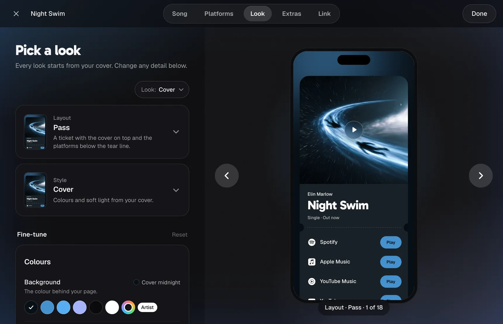
You could build a page in a website builder, but then you’re collecting the links and matching the colours yourself. A smart link tool is usually quicker. In meloshare, you paste your song link, it builds the page from your cover, and you can change anything afterwards. Here is how it works, step by step.